Looking for Payne's grey
Payne's grey is one of numerous colors , like Van Dyck or Hooker's green, to be named after a painter who was, usually, a little bit monomaniac on a tint. Van Dyck had a palette rich in browns, Hooker was a botanical artist who needed a special pigment for leaves, and Payne was a watercolor artist famous for the quality of his shadows. I really like this kind of colors : they aren't fixed values. They're ideas, a range of colors allowing little variations. Neither Van Dyck nor Paynes made pots and pots of colors marked with a fixed color code. Please don't give them a hex value, just bask in the delight of having an idea of a color. I'm a bit worried about fixing colors in set values. While we need fixed values for printing or design work, colors are like words : they need a little leeway as terms, they need synonyms, etymology, history, and if possible, errors in translation and evolution in time. They need to be a language of sorts.

Here's a watercolor from William Payne (1760 – 1830), via Wikimedia Commons. It's Public Domain, and represents a Hovel near Yalmton, Devon. Payne's grey is the array of blue grays in the background. It was originally a mixture of colors that you could find in a classic watercolor palette of the time. He recommended the use of this color to his students as a replacement for black, probably because it was a deeper and more interesting mix in the grays, and still very dark at a high concentration. Mixing Payne's grey with other colors is a very easy way to darken or desaturate them, explaining why it survived two centuries of very creative artists and is still popular today. You can find it in most big painting brands, especially as a watercolor pigment.
Now , I did some research about the original mix, and couldn't find a definitive recipe. Bruce MacEvoy of Handprint.com describes it as "a mixture of iron blue (PB27), yellow ochre and a crimson lake, used as a dark violet shadow color", Winsor and Newton talks about "a dark blue grey made from a mixture of Ultramarine, Mars Black and sometimes Crimson". Both mixes are consistent with the kind of colors you could find on a 1820 watercolor palette. It makes it difficult to know which one is the original, but both mixes produce a rich ternary (a ternary color is the mix of 3 primaries) color, a blueish, rich dark gray with hints of an earthy background.
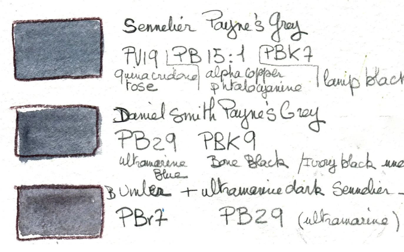
I did a little more digging, and found the composition of Payne's grey as sold in the 3 watercolor brands I use myself:
-Winsor& Newton : their Payne's grey is a mix of pigments PB15,PBk6,PV19, codes for Phthalocyanine Blue, Carbon Black, Quinacridone Violet. It's a mix of black, green blue, and a bit of magenta red.
-Daniel Smith : their Payne's grey is a mix of pigments PB29 PBk9, codes for Ultramarine Blue and Bone Black. This is just black and a reddish blue.
-Sennelier: their Payne's grey is a mix of PV19 PB15:1 PBk7 , codes for Quinacridone Violet, Phthalocyanine Blue Red Shade,Lamp black. Once again, magenta, a blue, and a black that goes on yellow.
I found the color codes here Color of Art Pigment Database. All these mixes will give you a dark blue color. It's nice, and ultimately it's close enough, really, to the original color. But it's not what was originally described, a nice balance of red, yellow and mostly blue, and absolutely no black. I think Payne created Payne's grey to avoid black in mixes, so I'm a bit confused.
I wanted to re-create the spirit of the original shade and tried the suggested 3 colors mixes.It was a bit frustrating and I'm not convinced. I needed a faster solution for quick on the go sketches. In a ternary color, there should be no black but the mix of blue, red and yellow. Note that I don't talk much of primary colors, they're a problem to me because it's, once again, a mathematical approach of colors. Primaries are an interesting concept, but we are mixing pigments,and absolutely pure primary pigments don't exist. Talking about pigments, we are accustomed for centuries to colors like umber, burnt umber, ocher, burnt sienna, ultramarine and cobalt, historical colors, so in the spirit of the search of an antique color, I went there first.
I mixed old, comfy basics until I could find a match, with no black, and the rich yellow/red undertone I wanted for a lively grey color.
I did this:
I'm quite happy with the burnt umber plus ultra marine dark blue as a mix for a nice, cool gray. There's this moment, while mixing, when a brown isn't exactly a brown anymore but not completely a blue that I find quite exciting. It's really not something you would get with a computer. By mixing burnt umber with ultramarine blue, you get different colors in the granularity. It's much more interesting than mixing black and blue.
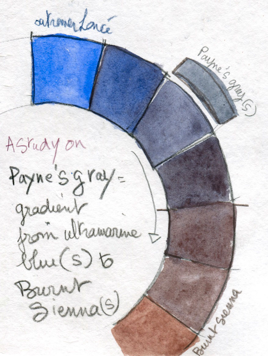
I also made some tests with Burnt Sienna and Ultramarine blue. I find the gradation between both colors rich of possibilities. Beware : my scanner adds a little magenta to the dark colors, and I couldn't really remove it without destroying the luminosity of the picture.
Looking for Payne's grey, I found a large array of similar colors, colors easy to mix, that will enrich my palette instead of getting stuck with a fixed black blue gray. I dedicated a whole well on my palette to these colors, with dabs of browns and blues that I can liberally mix. It's much more fun. Along the way, I also learned how different blues mix with different browns, all of them interesting and unexpected. Mixing pigments is much more creative than mixing lights (RGB or hex values). The intermediary colors are never quite what you expected. I got some really cool grays by mixing yellow ocher and cobalt blue, when I was expecting greens. I also got some very nice, soft purples out of iron oxide and ultramarine blue.
What the whole search really taught me was to understand what William Payne was looking for: beautiful, rich colors for backgrounds and shadows. I think I'm closer to the spirit of the color with my approximative mixes, than a manufactured mix of black and blue can be.
I did kept my tubes and pans of manufactured Payne's Grey. But I will use them for what they are, a mix of black and blue-red.
Here's a sketchbook of some sketches I made along the way while looking for Payne's mix. Making the last sketch, especially the trunks and the houses in the background, made me very happy. I could go from warm to cold easily, with just 2 colors on a corner of a well. It was fun and liberating.
Click links in the text for references.