Green is a difficult color
"Difficult colour... green."
(Constance, Countess of Trentham, in Gosford Park, Robert Altman, Dir.)
Now that I learned a bit I should probably redo this one...might be fun.
At first, I was surprised to hear this often after my first tries at watercolor. I didn't find it more difficult than other colors. Which I find, by the way, very difficult, all of them, with a revenge .
I might have a different approach that helps me a bit. I worked in CG special effects for a very long time. As in, since 1993. I did a bit of everything, but mostly art related to rendering: painting textures, and engineering materials. When defining 3D materials, an artist has to determine the physical properties of an object : is is reflective, what density , is is opaque, transparent, or in between ? There's something called subsurface scattering that computers now easily render : it considers the translucence of objects like skin...or leaves. Light is absorbed and then re-emitted according to the object color. All this gives me a different perception of the way light plays with trees, because I expect the physics of it.
So I guess you could simplify a 3D shader, as made as a Technical Director ( as I used to be), like this:
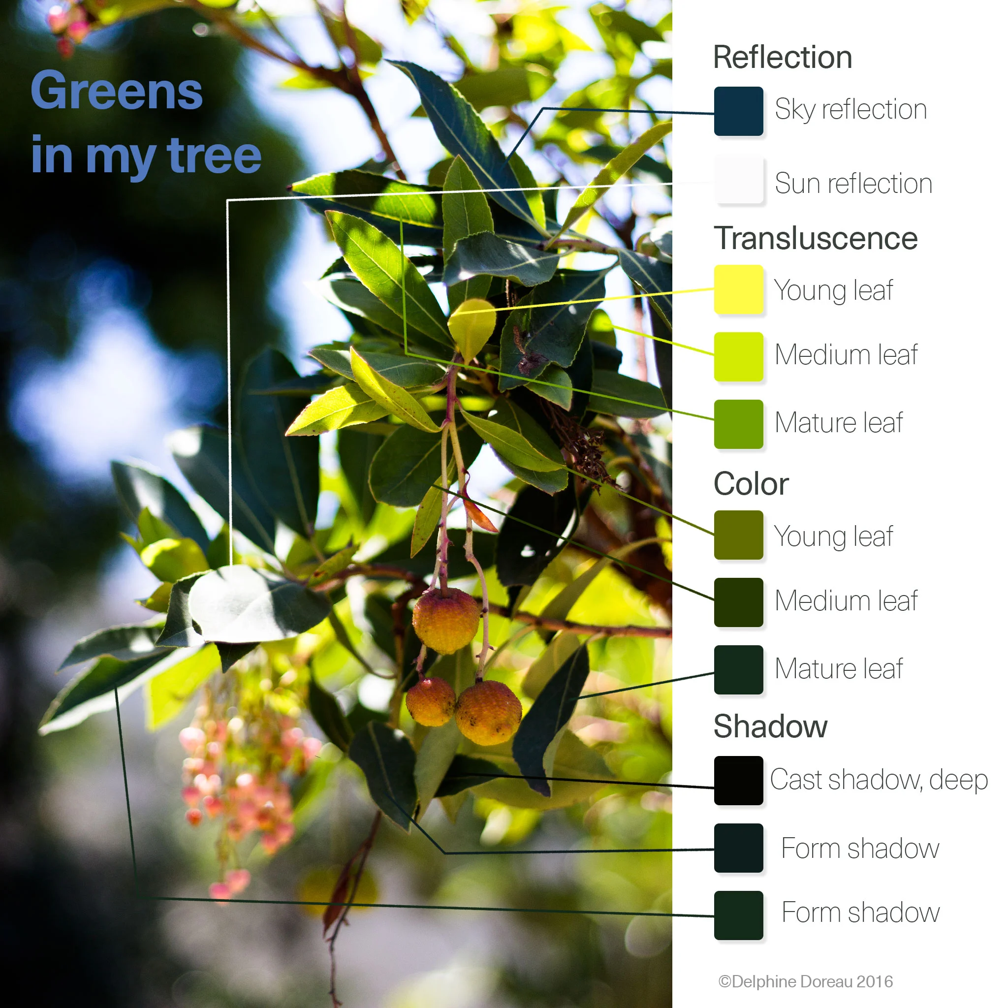
It sounded very clear to me, until I tried to apply these finds quite literally , on a sketch of a branch of the same arbutus marina:
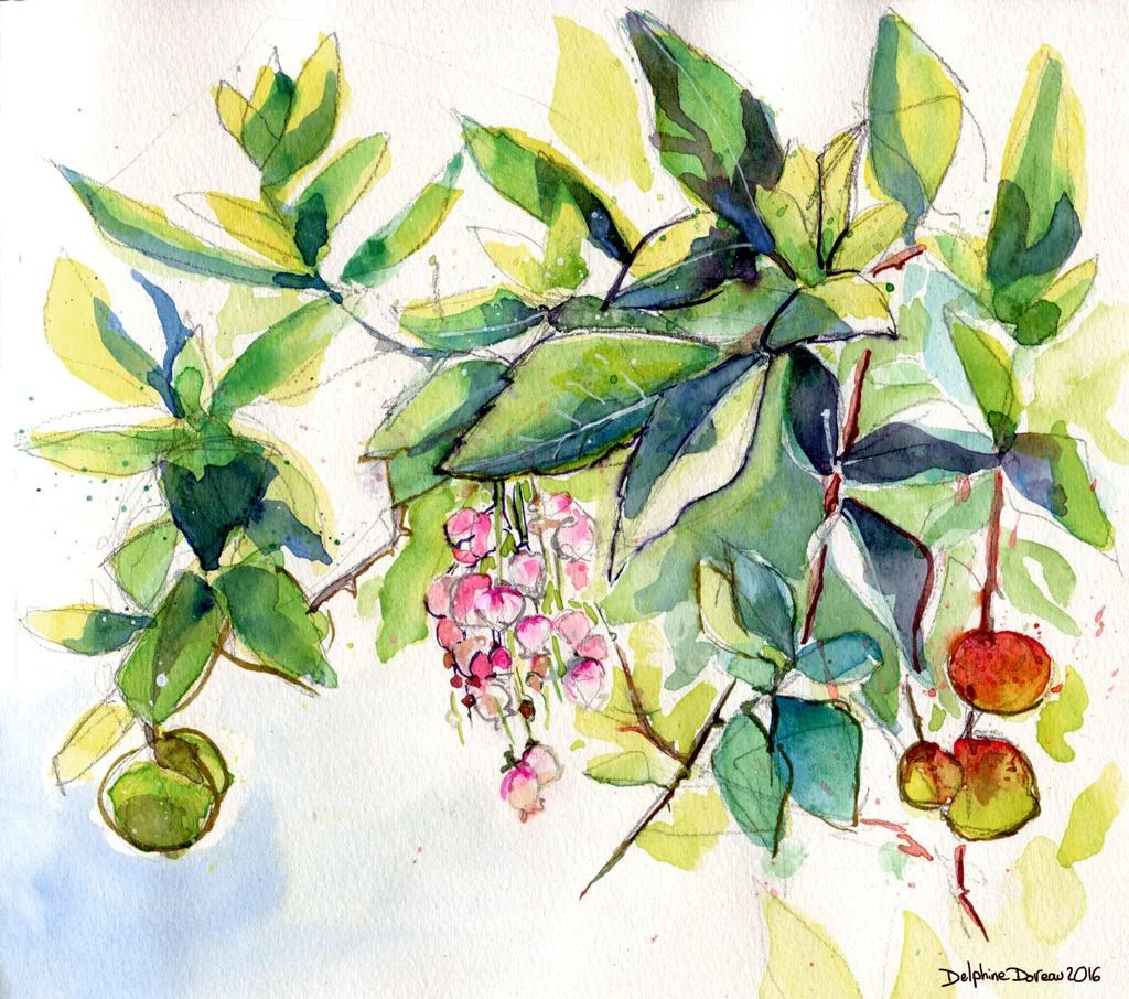
I'm not too happy of this sketch. I think I tried a little bit too much to respect the exact light that I quite forgot about structure, and colors. Making a picture like a bad photo without focus or purpose never gives a good result.
So I went back outside and tried a better construction, with again, true colors, or as best as I could.
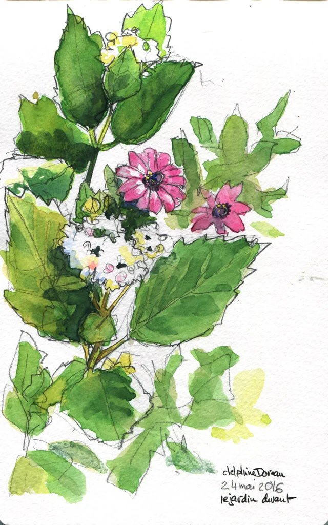
So Ok, the structure is better, but the colors were ugly. UGLY! I changed them into Photoshop. It was really ugly. I managed to use very bright out of the tube colors without thinking about what would be pretty in the end. Just because the sun is very bright here isn't an excuse to overdose on opera rose and sap green. Even if it's an exact rendering. But I quite like the light and the structure.
SO
As a last example, I painted a vase of flowers on a gloomy day. The light was subdued so I could study the colors better, and I made sure to mix what I knew of the leaves material, observation , and a bit of my very own color theory, which is to use purple as a complementary to green.
You can learn more about this here : a modern approach of complementary colors.
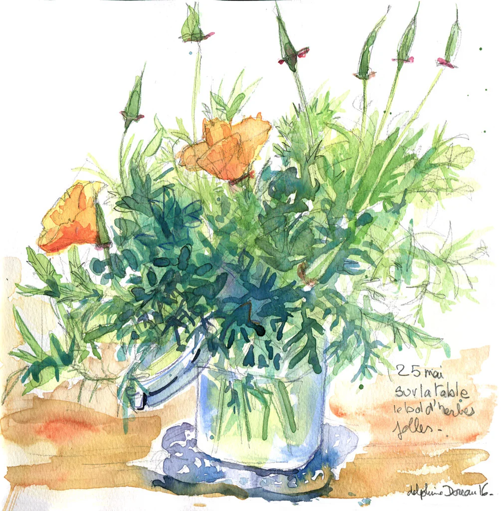
It's a bit better...But I agree : green is a difficult color!