A modern approach to complementaries.
Working on watercolors after 25 years of CG art, then publishing illustration books, I discovered one thing : there’s gazillion of ways to create colors, but only one to see them.
I know a lot of people won't believe it , but here is the truth about colors. Red is not really the complementary of green, and blue isn't always the complementary of orange, but purple is the complementary of green.
WHAT?!
Yes. And I will prove it . First, let's remember how we see colors. How we see them, really, not how we mix them. We are talking of perception here. How do your eyes ( and mine) see colors. You can mix inks or paints or whatever, but how do we perceive colors, how our eyes and brain see them, that's the real point in complementaries, right?
We have red, blue and green cones in the retina. Sometimes they don't work, or over work, or are a bit different. There is no Cyan, Magenta or Yellow cones, and certainly not Black ones.
We see in RGB.
Click on this link to a more detailed description of how we see on the Pantone Website : How do we see color.
I was looking for a way to generate a color wheel as we really see it, and finally settled for this fool proof method :
I made a RGB picture in Photoshop. I know I see more colors than the RGB spectrum on a computer screen allows me to generate, but we will have to settle for this for the moment (and for computers to be able to generate as much purple and turquoise we can see)
I made a vector circle, and filled it with a radiant rainbow gradient (360º of hues) with colors at full saturation. Then I selected a circle inside the circle. I could have made a rotation of 180º, or add 180 to every hue, but I choose to add an invert filter layer. Like that, if there was an error in my gradient, I would be sure to get the complementary ( aka inverted) colors.
Here's my new, computer rendered, color wheel: colors as my brain ( and yours) see them.
This might be very unsettling for you, but I was expecting something like this. I knew that Newton arbitrary chose the number of colors in the rainbow, and thought it might generate a flawed color wheel. Indigo someone? It was just a fashionable blue, added to have 7 primaries. There is no primaries. Only a gradient.
So what can we see? The outside rainbow is the colors I generated. The inside, the same colors but inverted. Red is the complementary of turquoise. Blues complementaries go from yellow to coral. And greens have complementaries from fuchsia to purple.
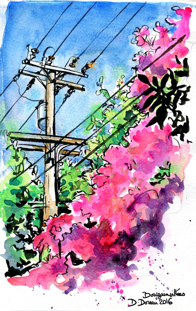
So basically, on this picture, the bluer part of the green foliage is complementary to the fuchsia of the bougainvillea. Not at all what I expected.
Since it was a bit unsettling , I made a palette of colors closer to the ones I use everyday in watercolor, and applied the same "invert color" Photoshop filter in the center circle.
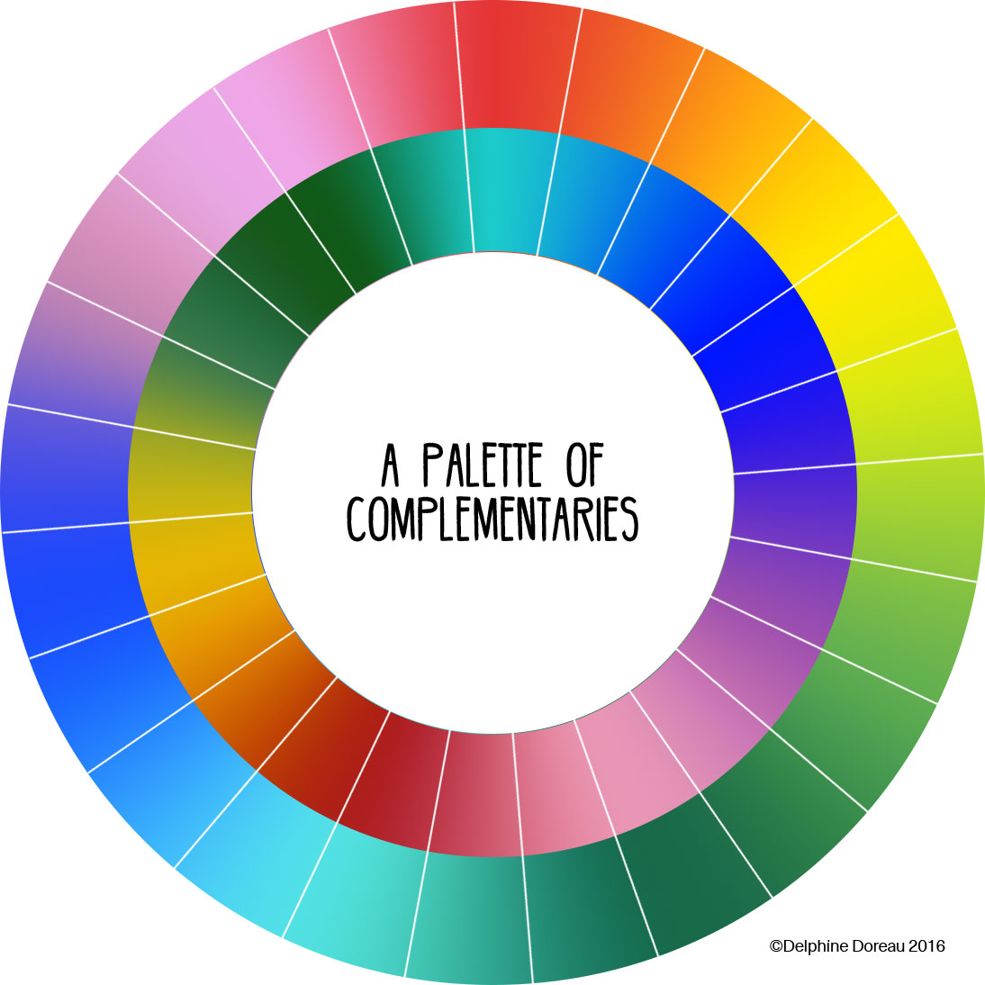
As a reminder, I inverted some well known colors, and the complementary colors I found are pretty popular! Yellow and blue combo is a staple in heraldic, green and purple were the favorite color combo for occidental men fashion in the eighties, teal is known to be the best color to complement white (pink) skin tones, etc.
So that's it. Not the color wheel you learned, but this one, which I find, if you may, prettier.
I knew this for a long time, but someone asked me why I make purple shadows in my foliages. There's just one answer : it's a complementary color, and purple pigments mix better with green ones than red. Try it!