About complementaries, follow up.
I'm a bit surprised by the popularity of my last post about complementary colors. It was very much read and very much reposted ( thank you!) . Please comment on my blog if you want a specific answer form me.
For those who know me, you already knew that I am a bit of a renaissance something. I'm a Photoshop user since 1991, I worked 20 years on CG special effects and movies, but also had a career as a concept artist, children's illustrator (hence this blog I created at first for my nephews and nieces) , books designer, creative director... I taught Master of Arts in University , I also dab in software ergonomics and UX, and I am a bit of a color expert. These days I'm learning watercolor because it's the most difficult art with the most beautiful results : I found, finally , a technique that will be challenging for life. Art is always challenging, techniques, not so much.
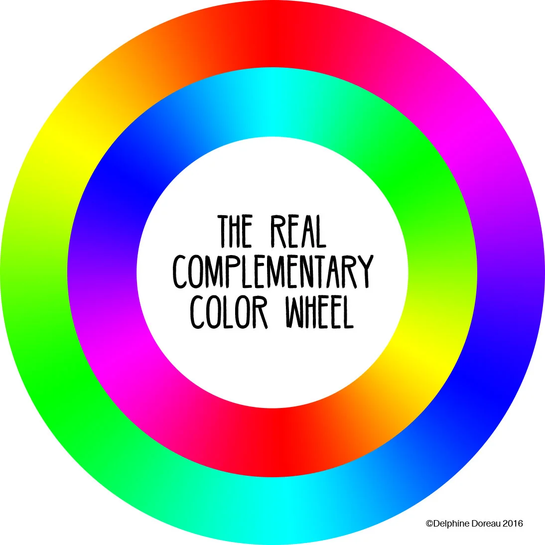
So, as technician before an artist, I just decided to render ( calculate) the complementary colors as we see them. We see in RGB. I inverted the gradient in RVB, and got the complementaries as we see them (more or less) . End of story, but a lot of reactions!
I will try to answer to that.
First of all, I will answer a question I often had : how those color complementaries ( as we see them) translate in my watercolor palette? I painted and scanned samples of the colors I have . Please cut me some slack here. I'm a beginner in watercolors, and my palette, an old Winsor and Newton box, is a gift from my Papa when I was 17, and supplemented by my family for my fortieth birthday. Nothing technical in the choice of colors, but I like the love my family put in my palette better than any logic...I'm slowly buying colors to complement it.
So. Here it is :
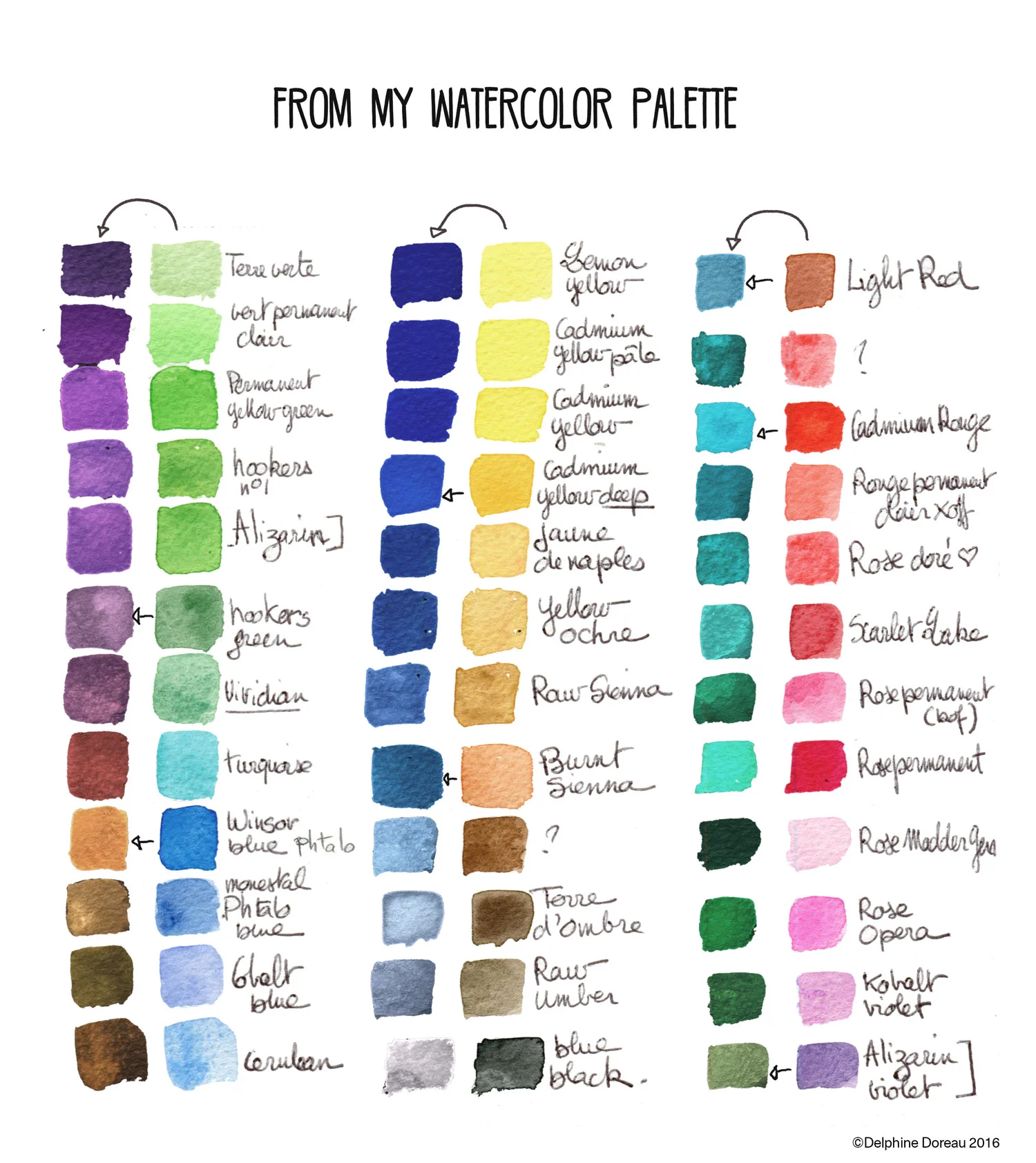
The colors are written in two languages, and I'm sure they didn't scan properly, but it will give you an idea. Watercolor pigments and tints are on the right and complementaries calculated in Photoshop with a simple ⌘i (invert picture), on the left. Like that you can see that a magenta like the Opera Rose has a nice bottle green complementary, and viridian green a nice viridian purple, which I find very pleasing. As you can see, too, apart from Viridian ( for chemical reasons probably), you can't get out of the tube complementaries . You'll have to mix colors to get an approximation.
BUT ( and that will answer to all other questions about the science of colors)
As an teacher and a searcher and an artist , I will tell you something. Complementaries are just a logical part of how you should use colors. They are science facts for that moment when you ask yourself how you can reach maximum contrast, what colors to use in a form shadow ( cast shadows are another problem entirely) , how to make colors lively and vibrant in a composition. But that's it. Color palettes, as choice for a picture, shouldn't be chosen from science. Or not always as a rule.
For example, you can make beautiful compositions using colors that were symbolic in specific cultures. I learned to paint like Magdalenians and ancient Egyptians for movies. It's a lot of fun and these palettes make good pictures. I also made research, for games and movies , of different palettes, like " Sixties Fashion in Eastern Europe" ( for a James Bond Game) or "Colors to wear in Middle Earth" ( I let you guess for what game). All these palettes were very different . And all of them were a lot of fun to define, and resulted in good pictures.
Working with complementaries, you will have to divide your palette in pairs (turquoise with tomato red, royal blue with lemon yellow, etc). It's very restrictive. So before correcting me, or contradicting or anything, I urge you to find your own palette by studying art and pigments, not by looking for truth or rules in science. Do you find the way viridian green mixes with quinacridone gold enchanting? Please use that. Is the way the Technicolor process in the 1938 "Robin Hood" movie enhances the costumes gives you jitters? Please analyse it. Do you have favorite painters, are a fan of Bollywood movies, do Sonia Delaunay or Helen Frankenthaler make you faint? Please study the pictures you love, and build your own palette.
Art benefits from science, but it's not a science.