Green is awesome
Green is a difficult color- stay away from it.
I heard that a lot, along with recipes to survive the ordeal that were incomplete or misleading. Indeed, what is taught in art school is incomplete, thus often wrong.
Here's what's taught usually about green:
It’s a mix of blue and yellow
It’s one colour
The complementary of green is red
It’s not wrong, but it’s as true as saying apples are red 🍏,and birds fly🐧.
There’s also very little understanding of how foliage reacts to light.
I will go through all this but the short answer is this:
your eyes see in RVB ( or close to how RVB works).
it’s several colours
complementary of these colours go from ultramarine blue to red
leaves are translucent
Green isn’t really a mix of yellow and blue.
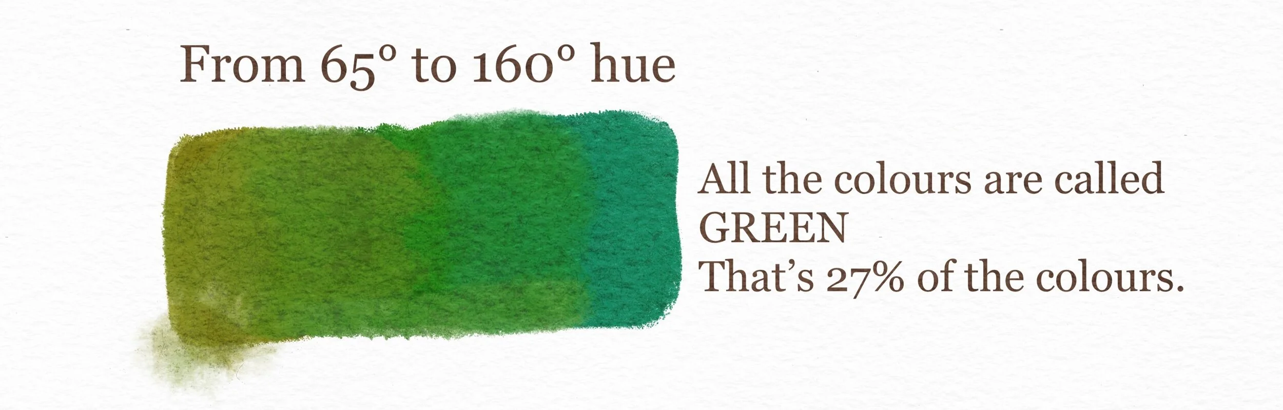
I mean, you will mostly get greens if you mix yellow pigments and blue. And there’s tons of green pigments too. What we call green is a length wave, usually anything between 495 and 570 nanometers. So something between 60+ and 160º on a hue scale. There’s 360º of colour hues, it’s about a third of the visible range. That’s a lot.
Now, our eyes don’t analyse pigments, they see and analyse light, in a way that’s close to RVB. It has nothing to do with mixing blue and yellow. Greens coded in RGB are a mix of red, green, and blue. All three colours. You’ve got greens that are a mix of red and green. And greens that are just green. And greens that are a mix of blue and green. It’s very different coding, as different as purple (red and blue) and orange (red plus green), for exemple. You can get more details about this here : color vision on Wikipedia.
If I look at how green can be coded (RG, G, BG), it’s at least 3 different colours.
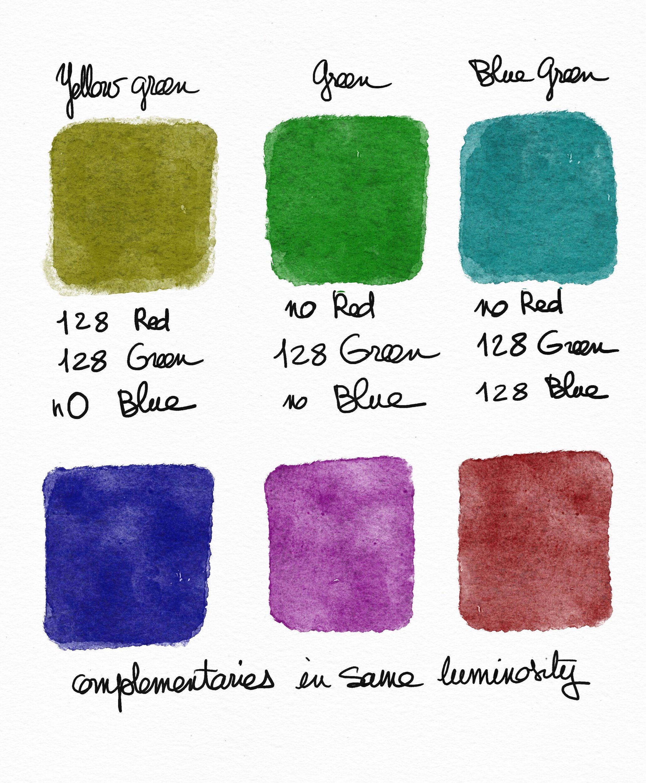
Suddenly green isn’t that complicated. All we need to do is think yellow green, green, blue green. For example, lime is a different color than a medium green, which is different from teal.
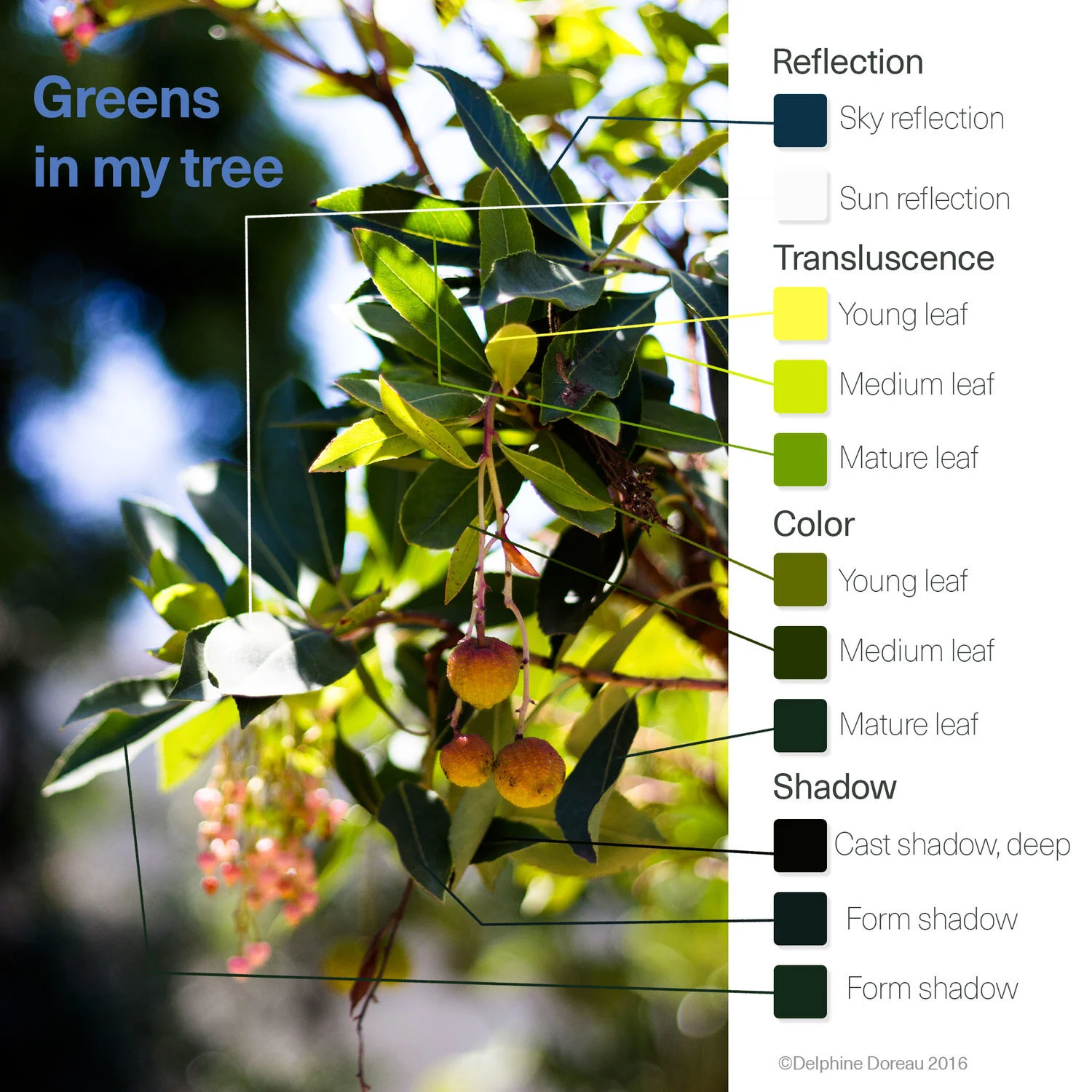
To that, you need to add another component : our eyes are unable to see dark yellows. We see them as browns for the golden ones or…wait for it…greens for the more lemon-y ones. I painted these olives with yellows, and the pears with yellows and yellow greens. Do they appear green? I bet they do.
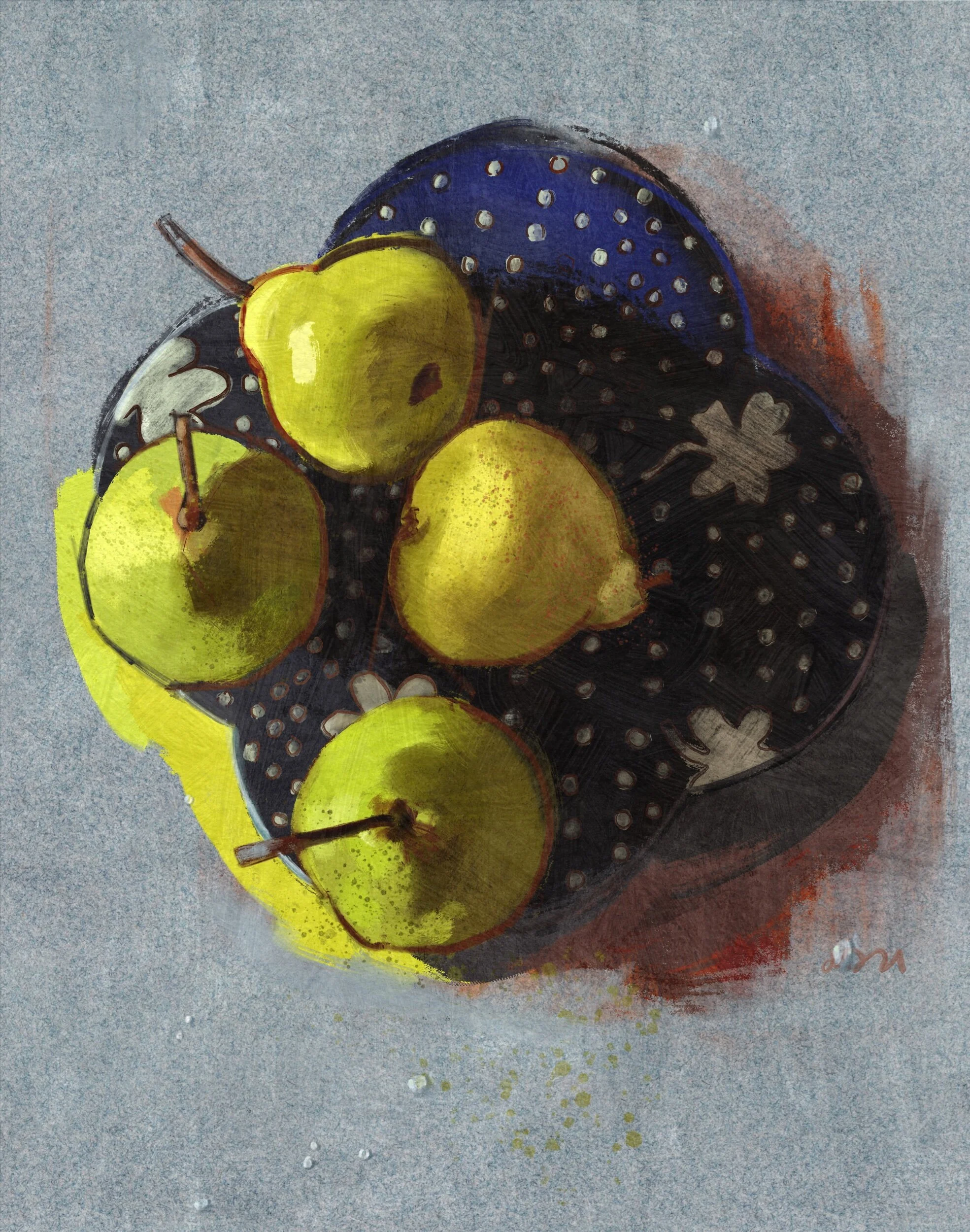
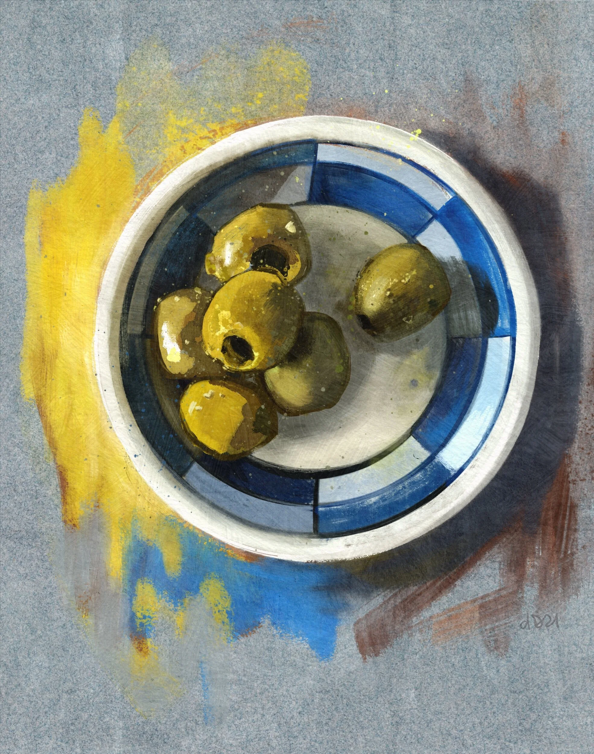
As a dear friend commented, there’s something really wrong with those lemons. The bright yellow on the left of the olives is actually the yellow I used to paint the olives, in a brighter shade.
So green is now greens, and it’s 4 colours.
Now about complementaries. I’ve been told numerous times to put red into the shadows of my foliage to create vibrancy and contrast. It doesn’t work, unless you like brown shadows. I like a good sepia sometimes, but I want my trees to look vibrant and lively. Reds, and especially tomato red, aren’t a good way to add depth and contrast in foliage.
First of all, a reminder as I already wrote an article about it (follow the link: A palette for greens). Leaves are translucent. They aren’t completely opaque, and while they reflect the sun white in the light, the sky (blue) in the shade, they are often yellow (or a greenish yellow) when the light goes through.
As noted, foliage is yellow in translucence, then mid greens, then dark blue green in the shade. All the green colours are present.
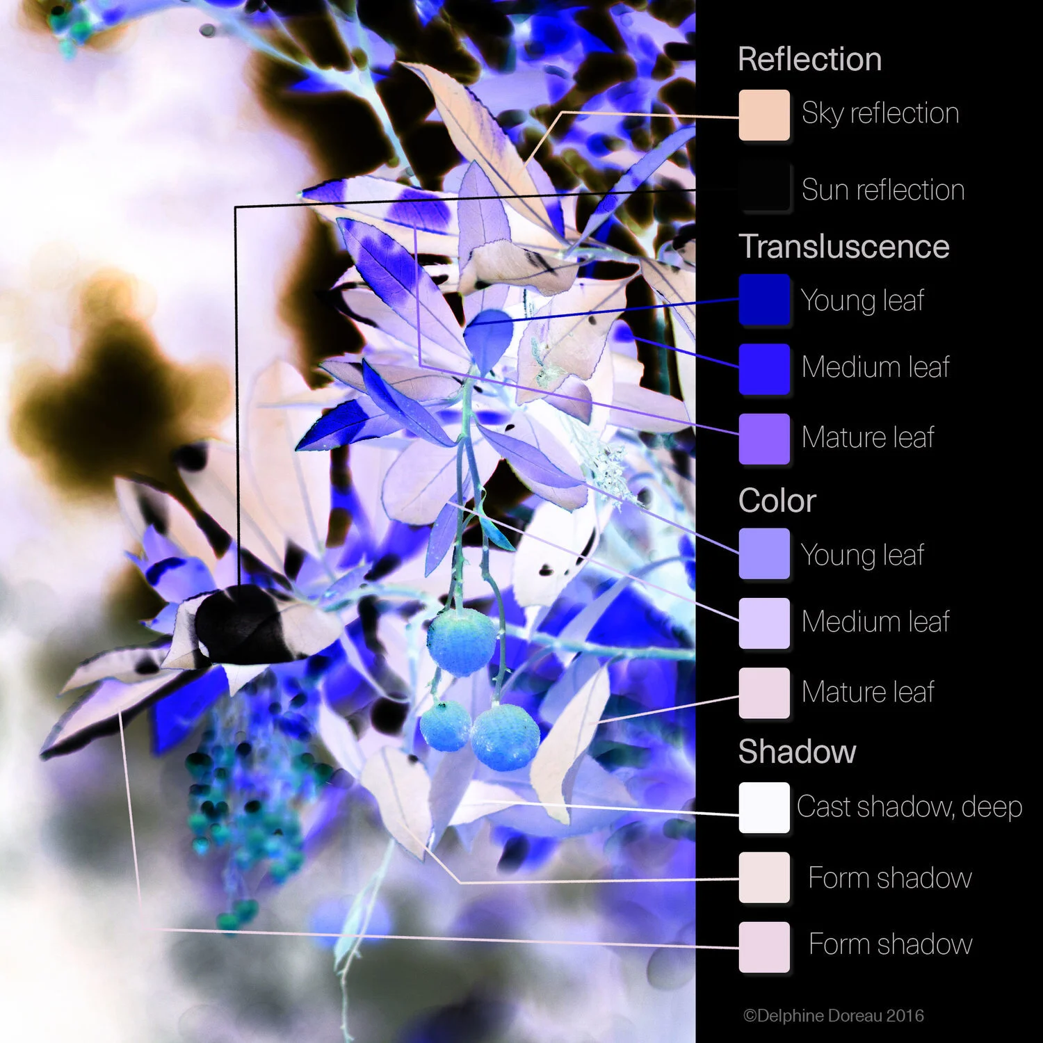
I inverted the picture to show the complementary colours (the Values are inverted, too). It’s calculated, as, I didn’t do anything but invert to show the complementaries:
DO YOU SEE REDS?
No. According to what we learned at school, such a big variety of foliage greens should bring an inverted picture of bright bold tomato reds, and except in the sky (blue) reflection that’s a bit orangey : NADA. No tomatoes. Red is still interesting with greens as a contrast colour, but it’s not the complementary (unless you use teals).
We get some bold ultramarine blues, indigoes, lavender, mauves. No reds.
I you want vibrant shadows by adding the complementary colour, start with blues and purples.
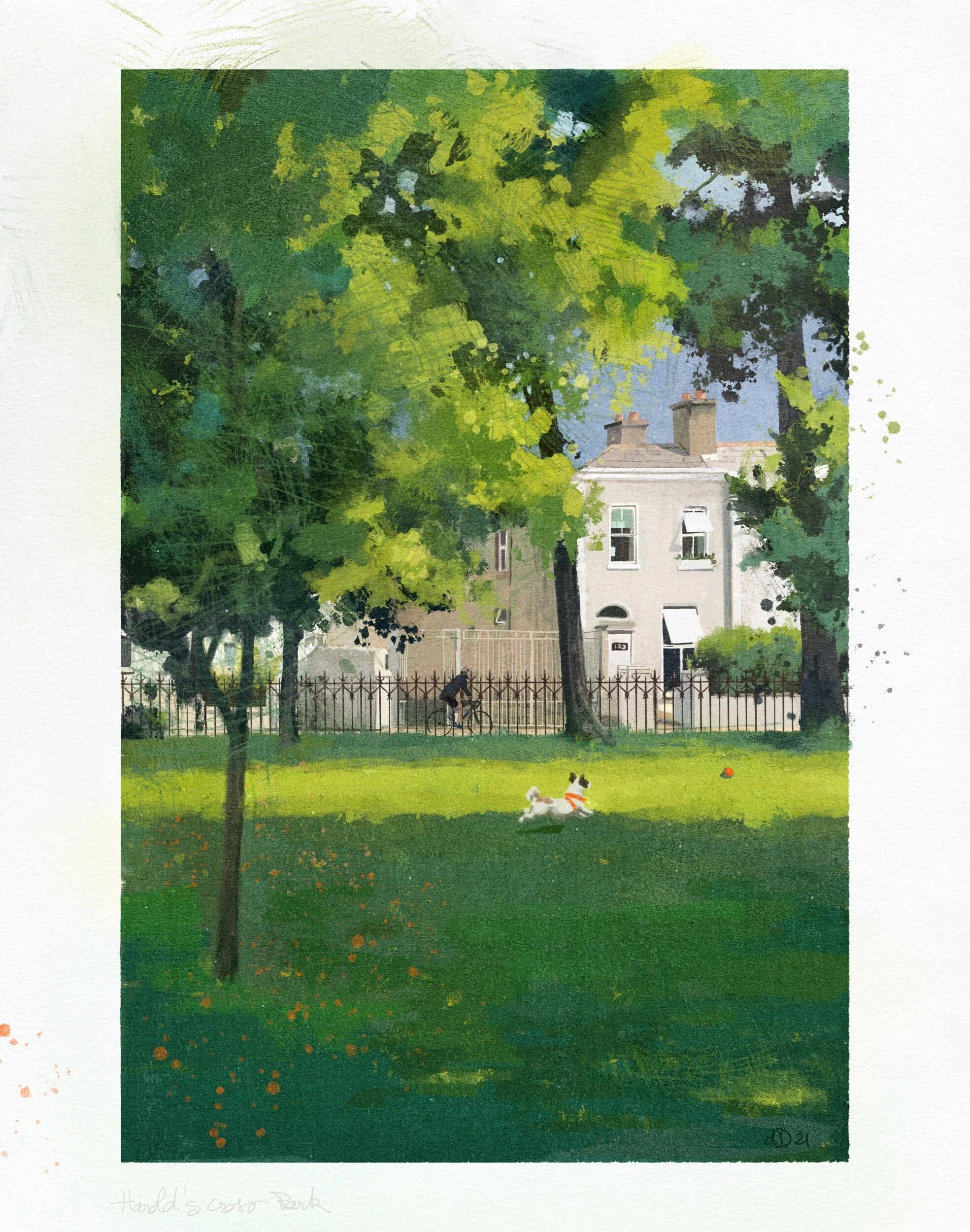
That’s what I did on these two pictures, using blues to add depth to greens instead of reds. To my point of view, it works better.
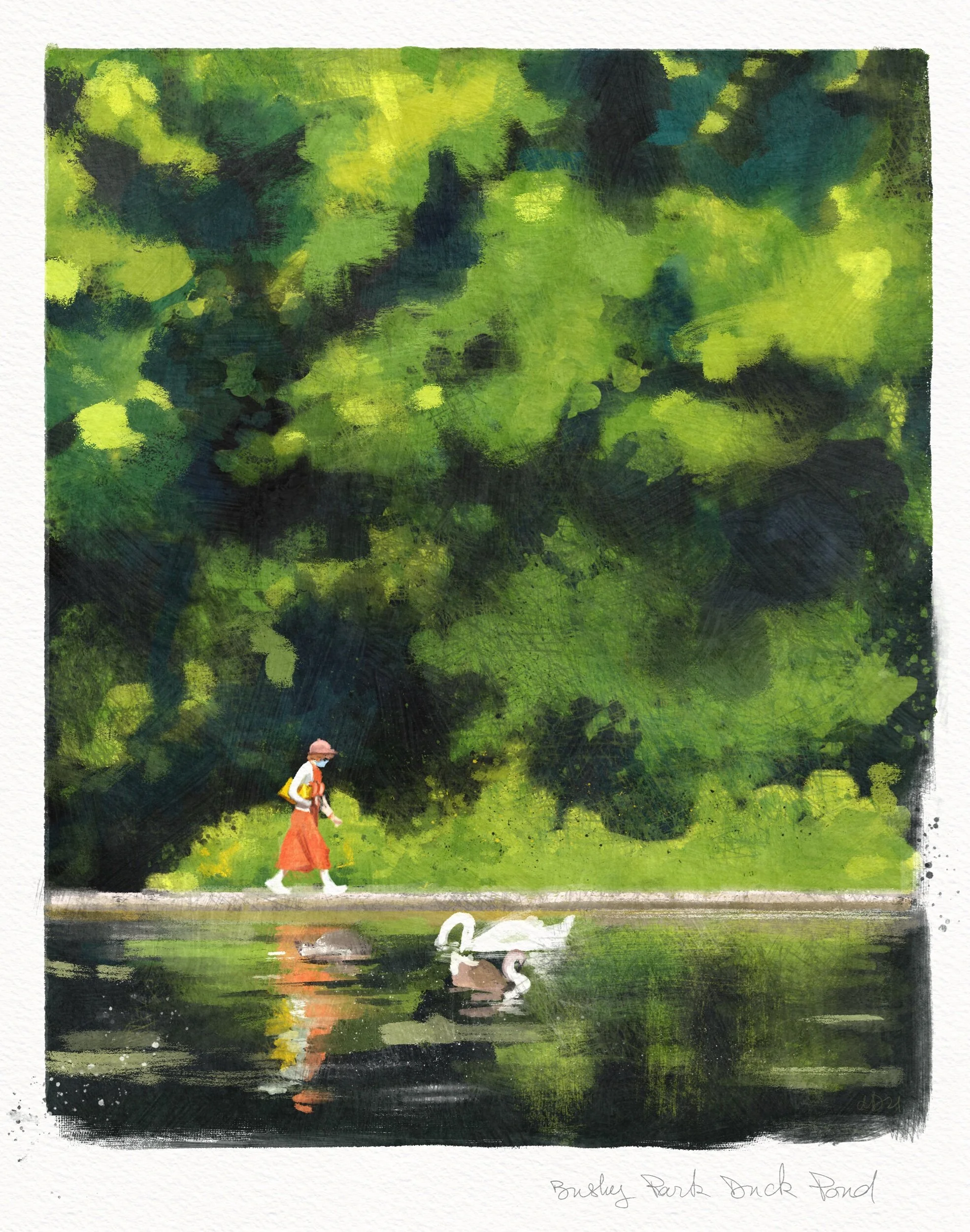
I still used red as a contrasting colour (it’s a joke. Probably not very funny). A bright orange or pink would have had the same effect : it’s not the complementary colour.
In conclusion :
green is four different colours at least,
the complementaries of most greens are a nice palette of blues and purples (I’m pretty sure if I dig in the turquoise and teals I’ll find some red complementaries),
and foliage is translucent from yellow in the light to dark blue green in the shade.
Green isn’t a difficult colour. It’s a palette of very lovely ones.