A palette for greens
I think I will never be done with green. I love to paint trees too much, it's a challenge that I enjoy very much.
There's several problems with vegetation.
The first problem is analysis, how vegetation reacts to the light? It's a color analysis, really.
Then we have a cultural problem. Our occidental society thinks that red being the complementary of green is science, which is not, and then there's the whole problem of complementaries, which tires me to no end. This is a very dense subject, I'll give a few hints today and I'll get back to it on another post.
Then there's a rendering problem : what are the best paints/pigments to use? This is a bit more tricky : there's technical answers, but there's a cultural part of the answer that is very open.
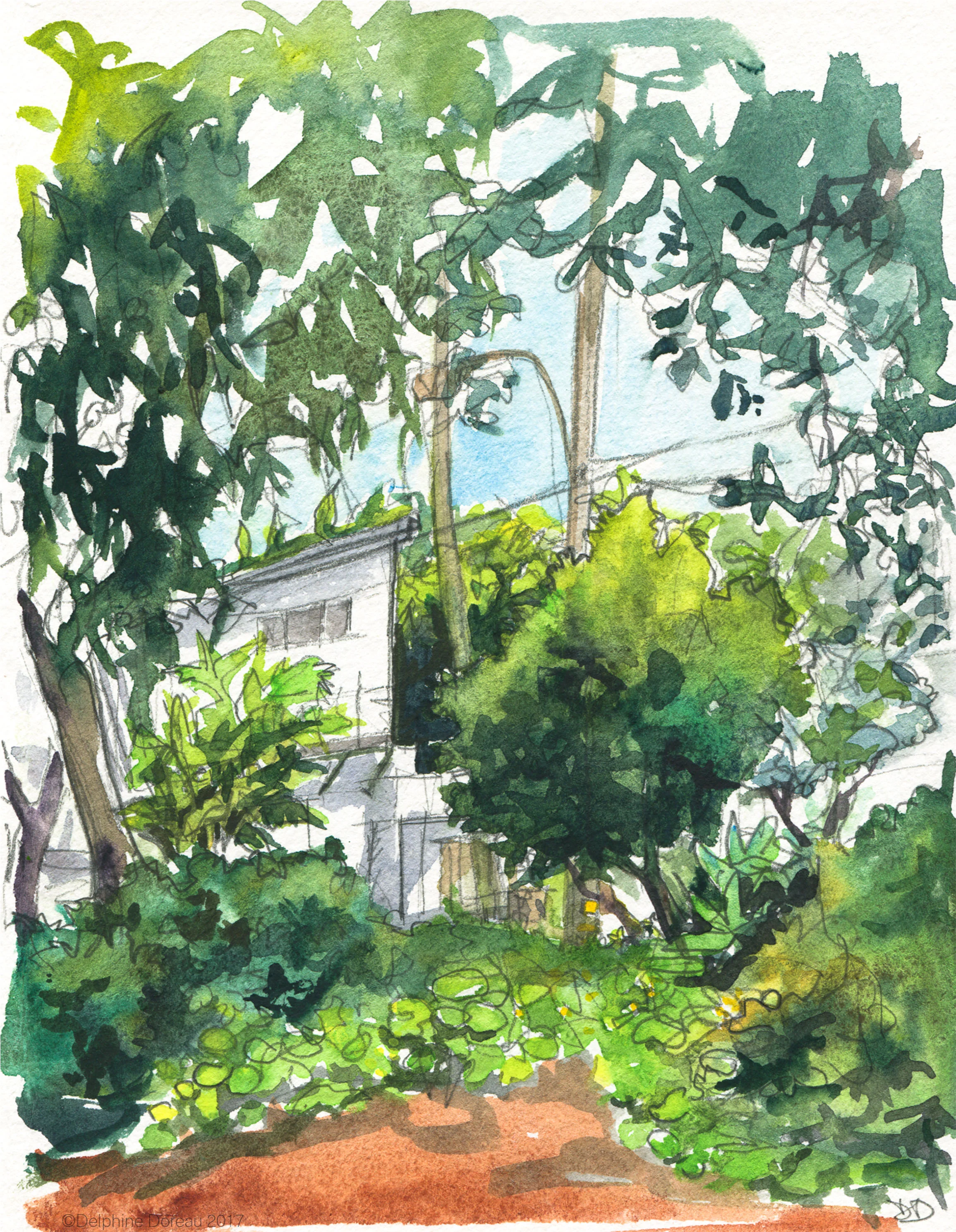
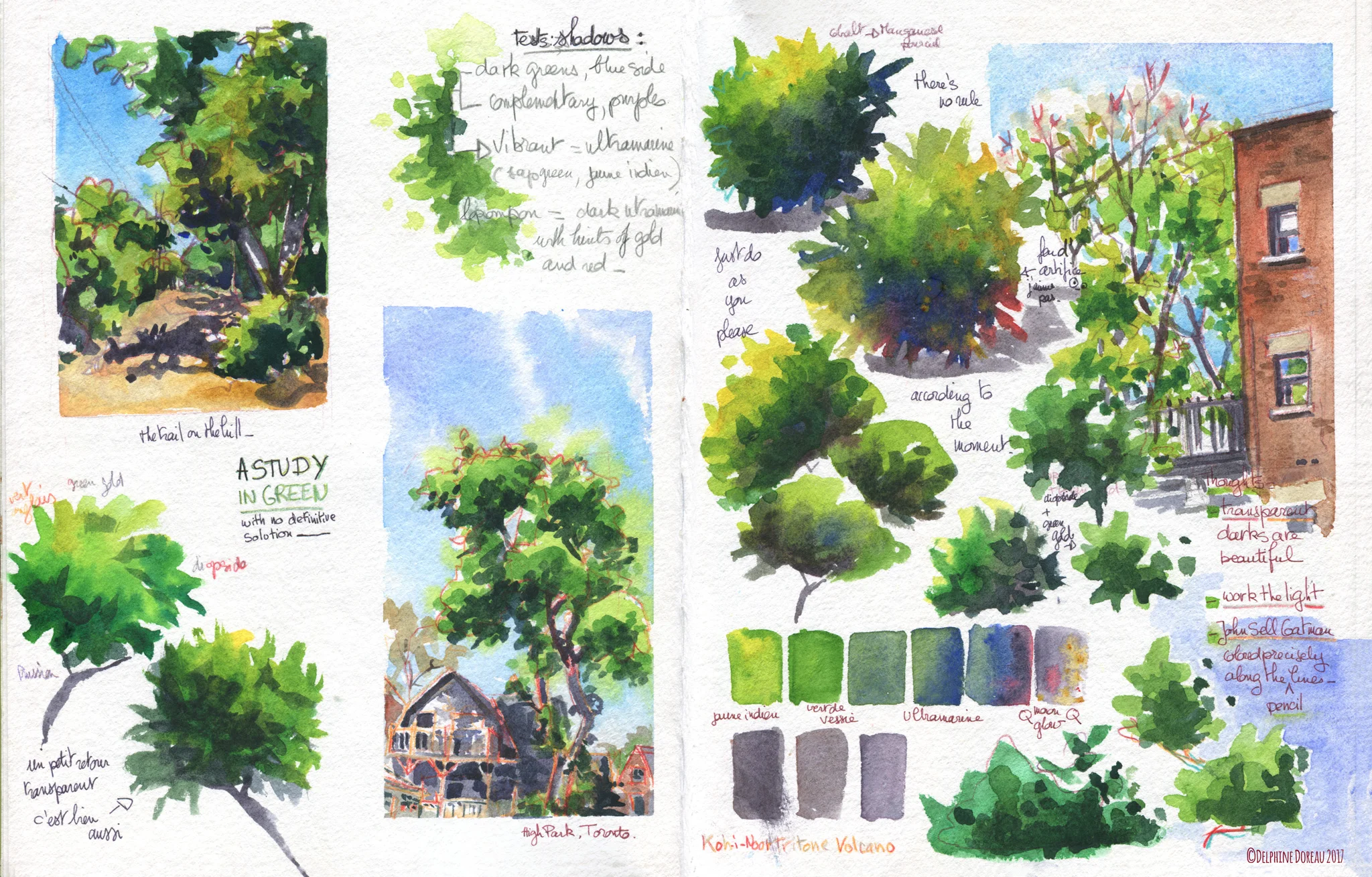
I made a sketch book while searching, look at it and let's talk!
First of all, color analysis. Art is art and if you fancy painting your trees red or blue or anything really, by all means, do it! But I was wondering what are, more or less, the colors seen in a tree. I like to really know what I'm painting before playing with it.
I already talked about it last year but don't bother going through all my posts: I found four kinds of colors in a leaf ( you can use this analysis for 3D rendering, too)
1. Reflection of the sky or light
2.Transluscence ( the yellow color of a semi transparent leaf with the light behind)
3.Color
4. Shadow.
The colors you see are one extracted from an arbutus, taken on a sunny day in California. Colors change from tree to tree. I was wondering if colors would change with different latitudes, and yes , they do. I took two pictures I took at a week difference, one in LA, one in Toronto, of trees of a medium green, early afternoon, and did some color analysis on my iPad with the Colorotate app
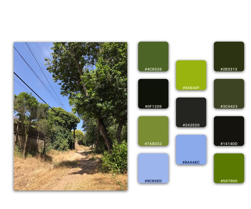
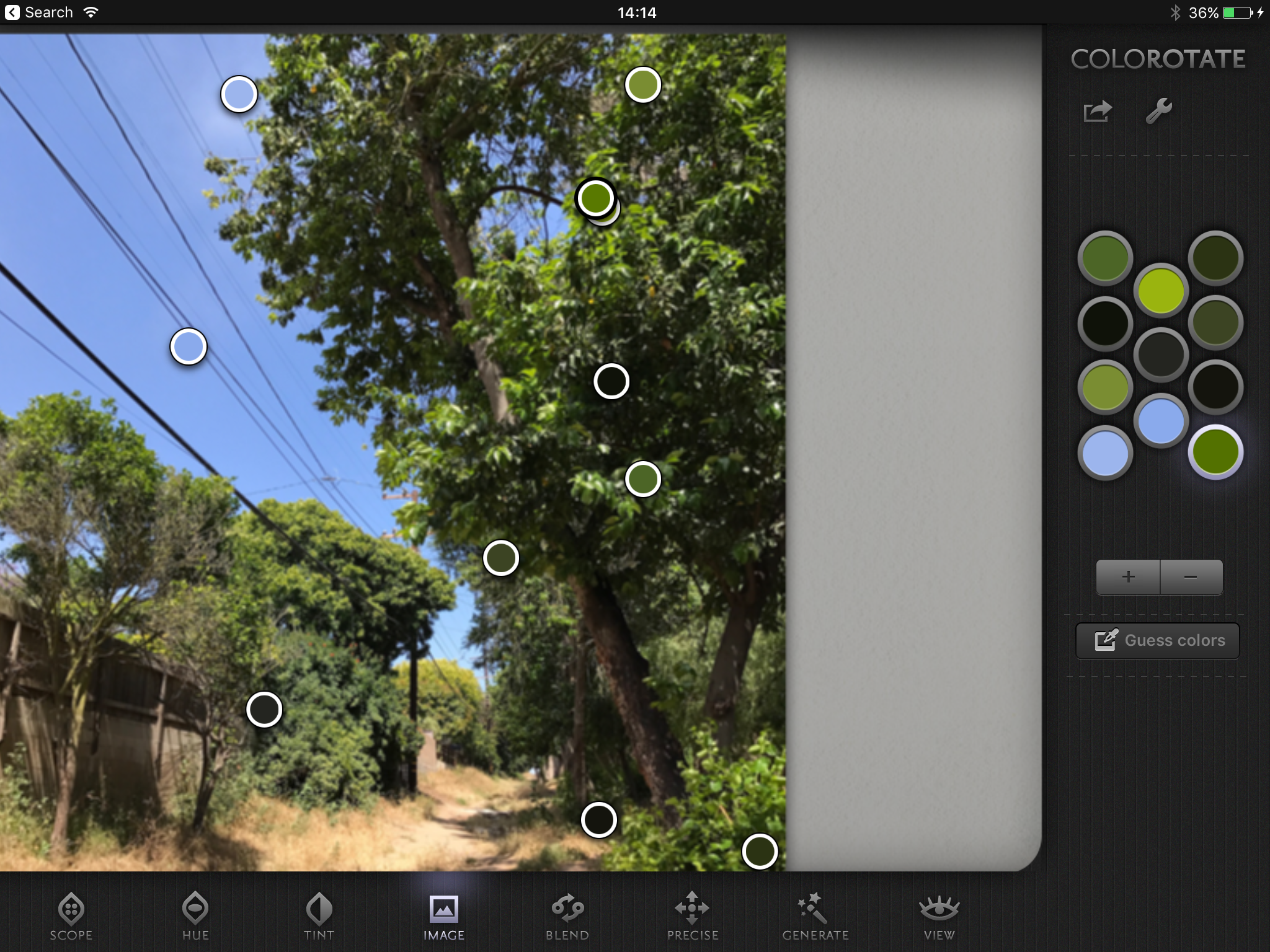
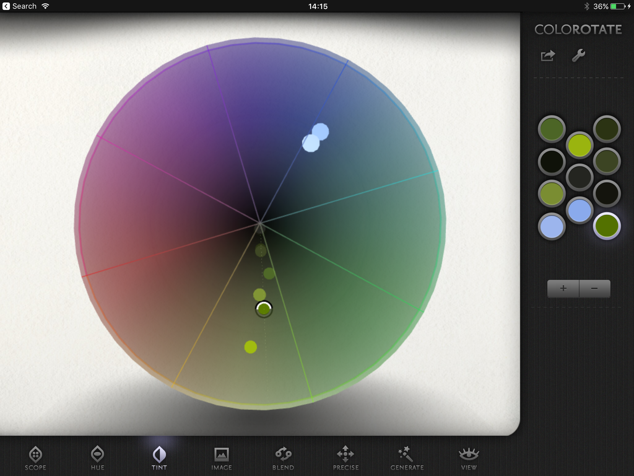
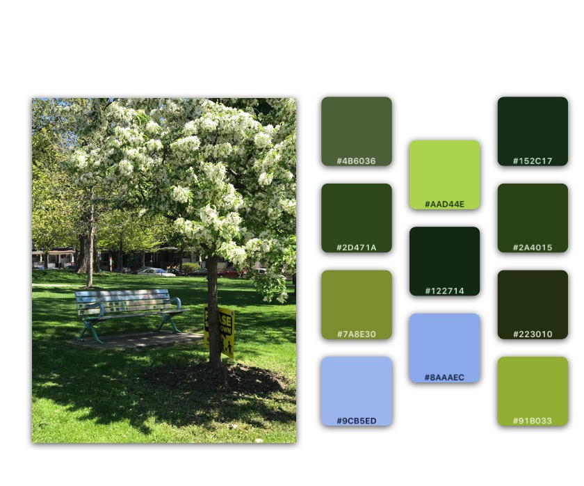
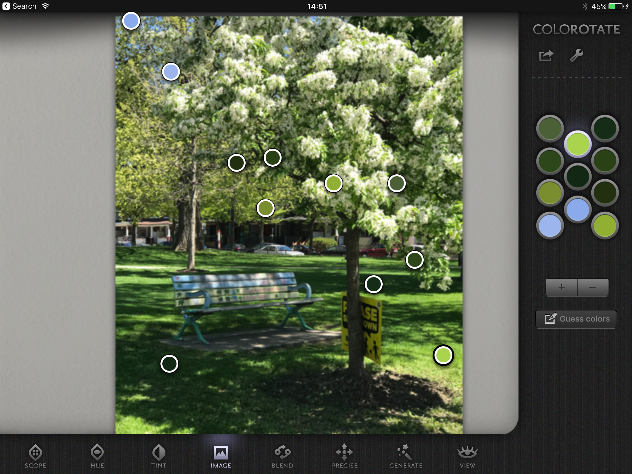
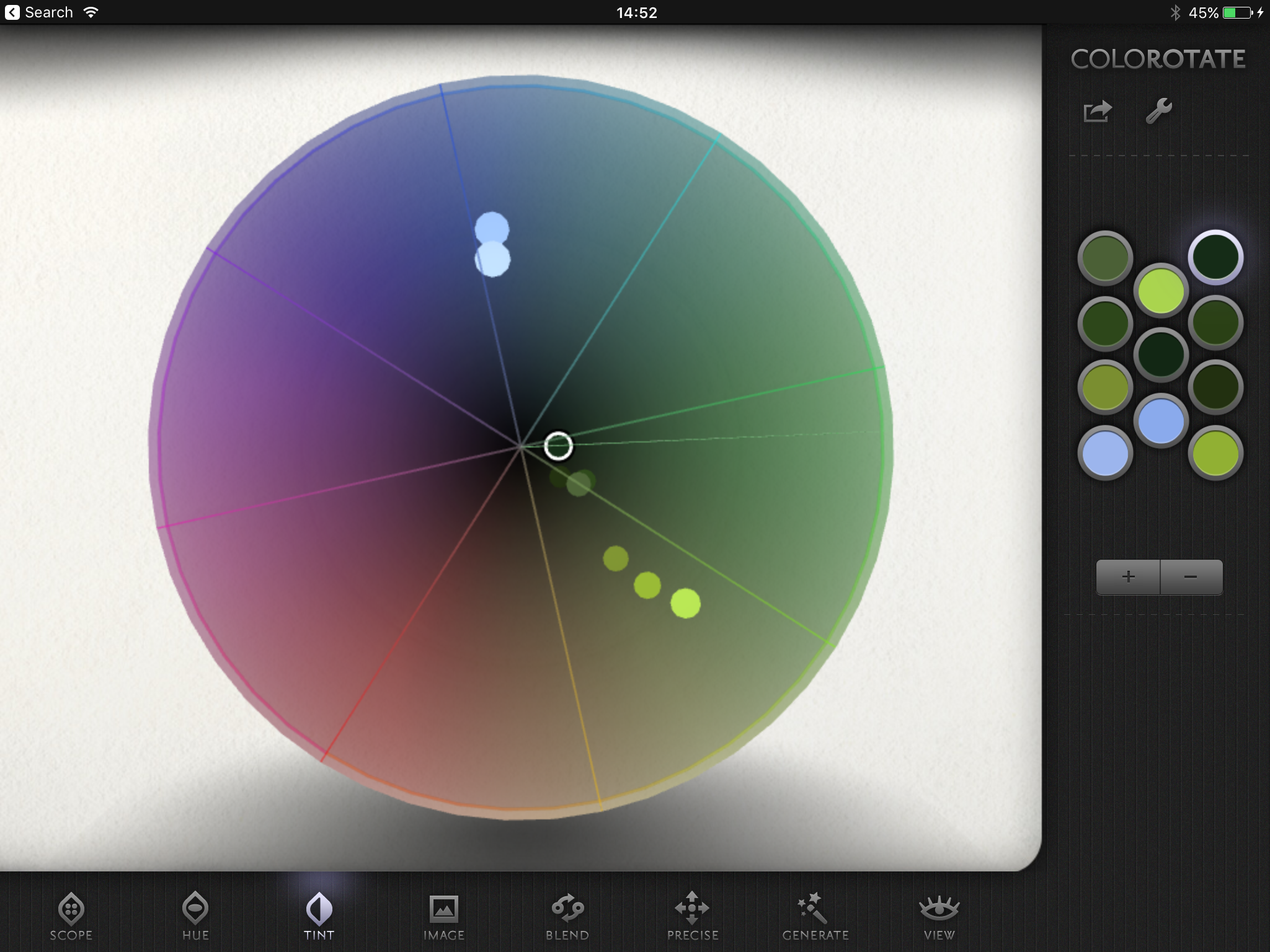
Please clic left and right on the carrousel of pictures to enjoy the full color analysis. As I suspected, the vegetation in LA is of a yellower green ( cooked by the sun) and the shadows are darker. Toronto vegetation is a lovely, spring green, and the shadows are bluer and less dark. The vegetation color, from the lightest to darkest, is consistently GREEN. Maybe more yellow in the light in Toronto, and bluer in the shadow, but that's it. After analysis, my idea is that maybe gentian blue sky, with a touch of purple, might be nice to complement the green vegetation. And maybe other colors, including red, as contrasting colors.
Now I often get the comment about putting red in greens. If you put red physically in the green paint mix, you'll get colors that go from brownish green to brown to an ugly black. I'm like, OK, but why would you do that? Please do it if you find the result interesting, but I find it rather dull. Or you could add a little red as a color. It's a contrasting color, not the complementary. But hey,contrasting colors are nice too.
Going back to the subtractive colors, as in, the art of mixing colors. On a whim a few weeks ago, I started to make note of all the pigments used in my watercolor palette. I can't do much for the composition of the vehicle (binders, plasticizers, etc) which are usually secret. But pigments are usually listed. So I noted patiently all the pigments in my paints, and then made groups and intersections.
I discovered that some colors in my palette are mixes of pigments that I have in other paint colors. Sometimes it was just disappointing (too many phthalo greens) and I removed the color. Sometimes it was super exciting , like for exemple Shadow Violet from Daniel Smith. It's a mix of Viridian green, Ultramarine blue, and Pyrrole Orange. It's a nice little color scheme with colors that proved to mix well together, and I was super excited to use them as a "restricted palette" exercise. Also, by adding one of the 3 pure colors (pyrrole, ultramarine, viridian) to Shadow Violet, instead of creating a duller color like it would with any other color, the mix become more vibrant. A fine little trick that pushed me to make some more tests.
I reorganized my palette according to pigments. Phthalo togethers, ultramarines together, etc. When there was a composite color, I tried to put the color that were part of the mix together . For example, I put Nickel Dioxine Yellow near Sap Green in the ultramarine part of my palette, as my sap green is a mix of this yellow and ultramarine blue. I was a bit afraid of the result compared to a more classic rainbow of colors, but it's much more comfortable to use and easy to memorize.
And then I tried to use this new color palette with family of colors in mind. I know that you can mix pretty much all watercolor paints together, with some exceptions (Cobalt Teal Blue for example, doesn't mix well with non-cobalt blues), but I also noticed that color mixes can go a little bit muddy, depending of the mix. Now most of the time I think it's due to the paper if I can't get the vivid transparency I like in layered colors, but I wondered if by using color Families instead of the one I liked in the moment it would work better. It does work better! Mixing phthalo greens and blues with the appropriate yellows does give a more vivid composition. It's not a strict rule : I also noticed that the Daniel Smith's Primatek greens that I own mix pleasantly with each other, and they all are different monopigments colors.
But it's not stopping me to use whatever color I fancy. This is art, not pure science. I didn't solve a problem, I just learned to be more familiar, organize, and fully enjoy my watercolor palette. It was really interesting .
If you wondered why I talk so much about colors : I have 26 years experience using Photoshop, 20 years in CG painting for movies and TV, 7 years designing books, 2 years art Directing. All these fields have a different color culture and I'm quite excited to analyse yet a new way for me to enjoy colors.