#filter #nofilter
You probably never saw the first ashtag, and quite often the second one #nofilter. It means that the photographer is quite happy to tell you that he didn’t touch up the shot. I understand that after a quarter century of over-photoshopping it might be a relief. Sometimes there’s just the right light and the photographer was there just at the right time and framed just the right shot. There’s even an app to calculate exactly the right moment for blue, gold or eclipse hour for the perfect shot ( it’s called Photopills). It takes real craftsmanship.
Sometimes the #nofilter shot is just…bland. There’s a reason there’s so many ways to spruce up a picture.
I learned photography professionally, before the era of digital photos. I was taught how to spend HOURS in the dark room, trying to bring that light or that contrast that my eye did catch and that the camera couldn’t. A camera isn’t the humain eye, and doesn’t analyse like the human brain. We see contrast and focus differently than they really are ( I suggest you watch this video before sending me angry comments about your perception of reality : checker shadow illusion). Sometimes, and actually most of the time, it’s OK, if not necessary, to touch up a photo to make it look like what you saw, or better, what you wanted to say.
I’m a bit claustrophobic and I hated the smell and the frustration of the darkroom. I was more than glad to switch to Photoshop as soon as it was possible in 1991.
I like to have a clear point of focus in my pictures, to share colours as true as I saw them, and I’m not too fond of high contrasts and lens distortion, while I like good old fashion things like bokeh, short depth of field, and vignette. You might have different concerns, or like different effects. Photography is a language, an art and a technique. Enquiring a little bit about it might give you ideas on what you really want to see, and how to do it.
Before touching up a picture, you should know where you want to get it, what you wanted to see, and very simply, what you saw and isn’t clear enough in the shot.
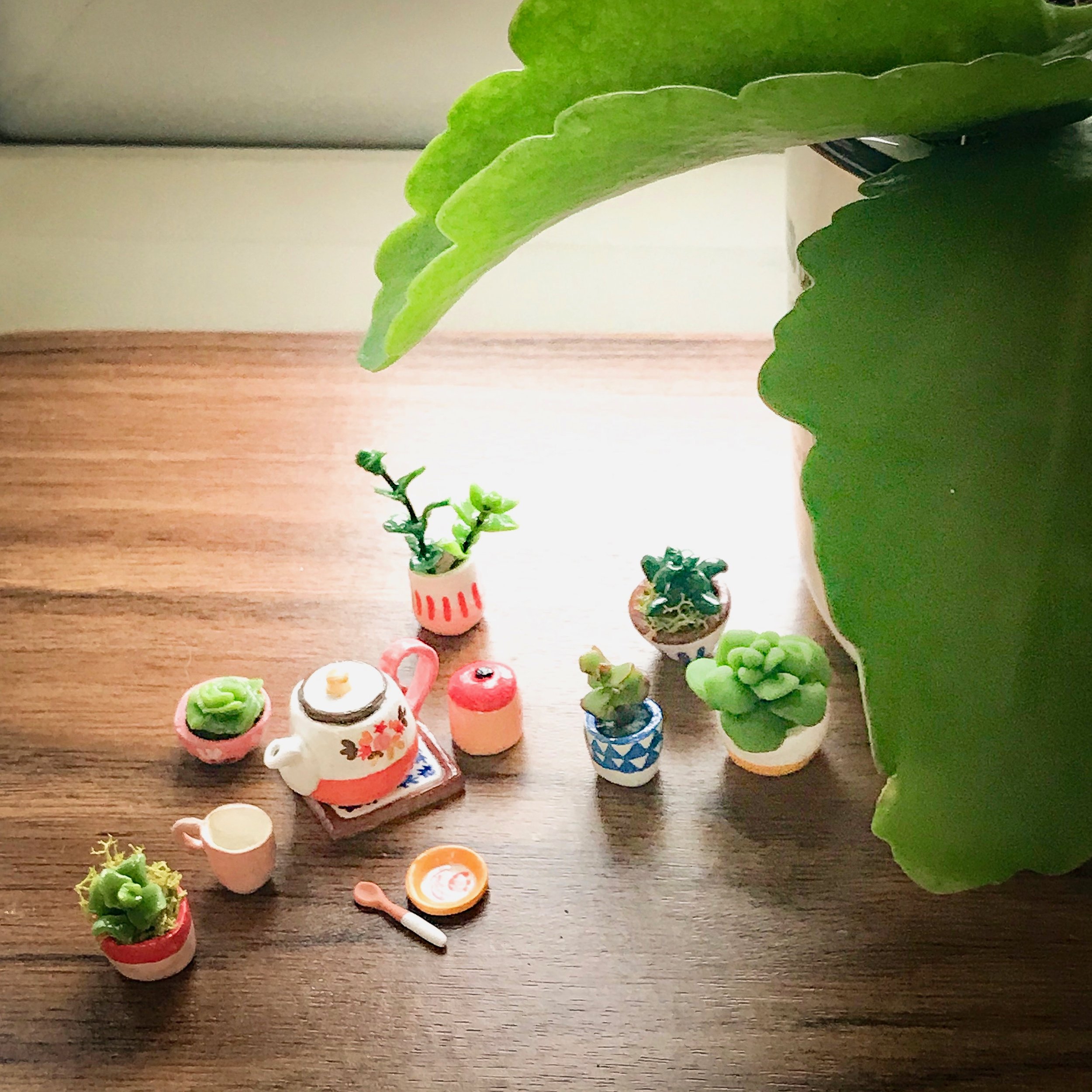

For example, what I was trying to show here was how the new miniature plants I made played with the real succulent on the right. The only place were I could get enough light was on the window sill, and back-lit, so the result was very frustrating. There’s a blob of light on the sill and a few shadows, not the delicate play of tiny ceramics and greens I was envisioning. Plus, there was a horrid lens distortion (the kind that makes everybody’s nose big on selfies).
I touched up the picture with the Lightroom app on my Ipad. It’s a professional tool, part of my Adobe subscription, so not really the best one for casual use…the Instagram app is actually very good for simple editing if you want to get a start on it.
The idea isn’t to make the photo look old or fancy or whatever. I just made it look the way I wanted : luminous, and happy. For fancy or fun, you might want to try Hipstamatic, which has those abhorred filters and good quality editing tools.
A little trick when you want to push the luminosity : keep some low lights and some blacks so it still looks grounded. I also add a little saturation to bring back definition to the picture. Saturated colours always look a bit darker than they really are, but they are luminous, so it’s more fresh than adding contrasts. Hurray for colour.
Remember that picture of a sunset that didn’t look at all like the sunset you saw? Yeah, it didn’t look like the sunset you saw, as your camera automatically balanced the lights on the whole shot, delightfully killing all shades and hues. Try lowering the highlights, and maybe the “dehaze” tool if your app have one. Most editing apps have the same basic tools by the way.
They will play with two things: light intensity, and colours. The light intensity is pretty obvious, more light, more dark, etc… sometimes with detailed changes in low and high lights, contrast, this kind of things.

For colour editing it will mostly start with light temperature, more blue or more orange, as in daylight and electric light. Then it can be more fancy with saturation options, green and purple, plays on different colour editing. But mostly the light temperature will do some dramatic changes to your pictures.
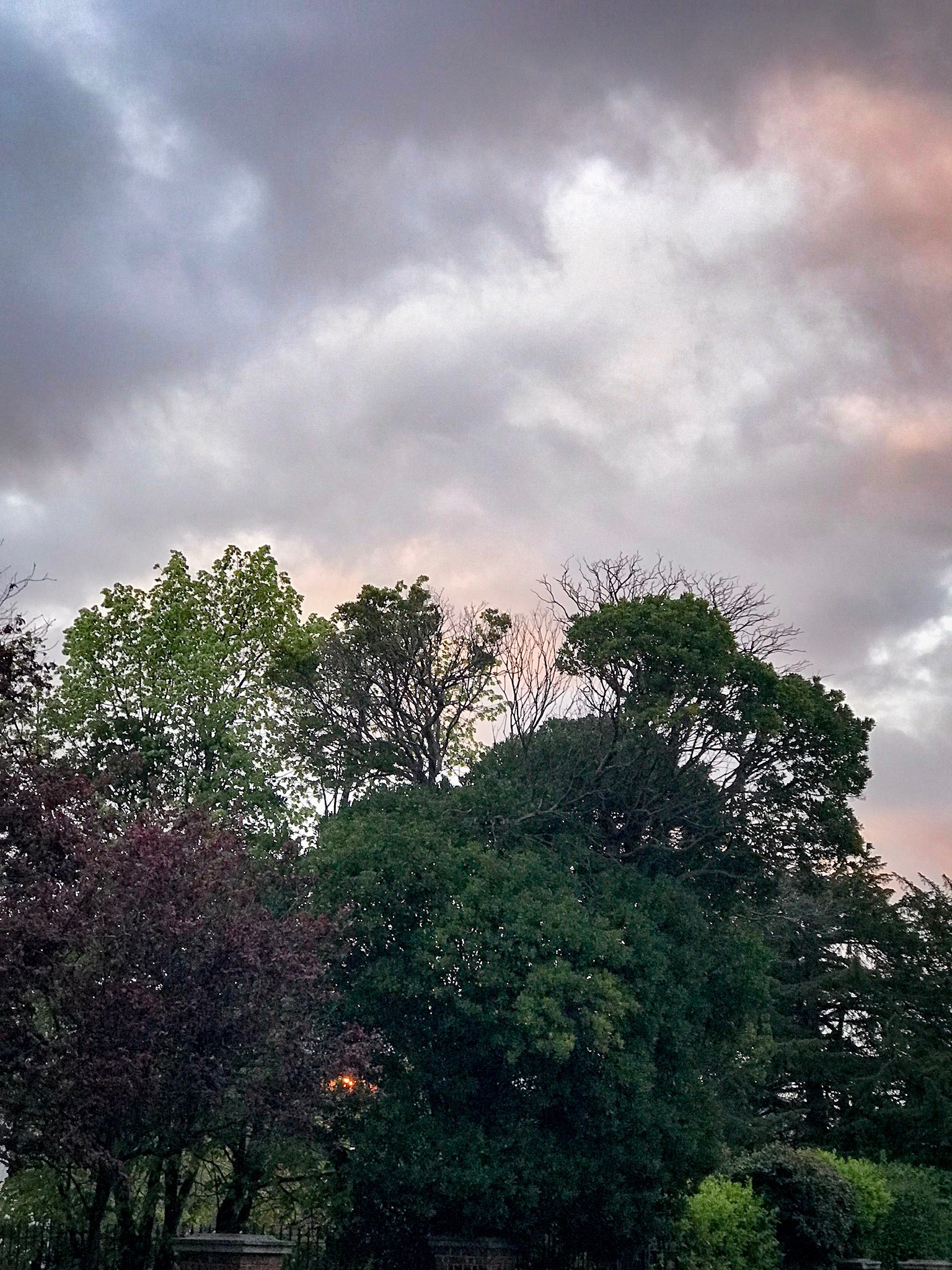
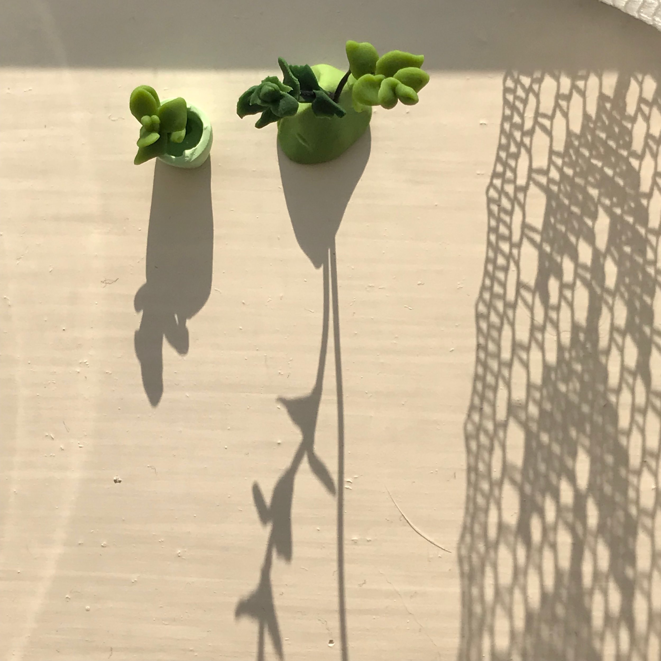
I took this picture at the end of the day, the golden hour. I didn’t want a golden photo at all. Often the sun peaks under the clouds just at this time of the day, and that’s the only sunshine you’ll get, so that what I got here. I then played with the light temperature to bring out the greens and remove the orangey tint on the delightful “rental magnolia” of the window sill.
Here, I also removed a paintbrush hair that was stuck in the paint and was very visible against the soft structure of the paint and the contrasted texture of the shadow. It didn’t want that kind of distraction so I used a tool that’s usually made to remove blemishes.
As you can see, we are very far from the kind of trickery that will make you and your aunt extra thin with no wrinkles. It’s just about bringing your vision in to the light. I hope it will inspire you to download and try a few apps. Enjoy!